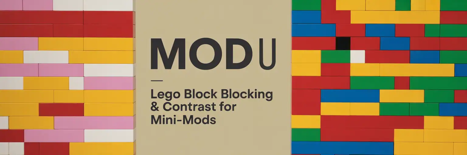
Why Color Blocking Matters for LEGO® Mini MOD Builds
Small LEGO® builds live or die by visual readability. On a tiny footprint, every stud and every color choice has to earn its keep. Smart color blocking and contrast make your mini MOD builds pop at a glance, separate shapes, and highlight your focal detail—whether someone is seeing your MOC on a phone thumbnail, a social feed, or a marketplace listing. This MOD U lesson gives you a repeatable system for high-contrast LEGO color blocking that works with the bricks you already own.
The Three Core Rules of LEGO Color Blocking
- Limit the palette (3+1): two mains, one neutral, one accent for clean, graphic reads.
- Separate by value: keep light vs. dark on adjacent planes so edges and silhouettes stand out.
- One accent, one job: use your accent to point directly to the focal detail (sign, canopy stripe, flower, logo) and nowhere else.
Starter LEGO Palettes You Probably Already Own
You don’t need rare bricks to get pro-level color blocking. These starter palettes are built from common LEGO colors and work beautifully for mini MOD scenes and micro-dioramas:
- City Pop: Bright Light Blue (main), White (main), Light Bluish Gray (neutral), Yellow (accent)
- Industrial: Dark Bluish Gray (main), Light Bluish Gray (main), Black (neutral), Trans-Light Blue (accent)
- Desert Tan: Tan (main), Dark Tan (main), Reddish Brown (neutral), Dark Red (accent)
- Forest: Dark Green (main), Olive (main), Dark Bluish Gray (neutral), Bright Light Orange (accent)
Tip: If you don’t have the exact color, substitute by value (light vs. dark) instead of hue. Your LEGO® photos and thumbnails care more about contrast than perfect color matching.
60-Minute Build-Along: Turn a Gray Blob into a Readable LEGO® Mini Scene
Goal: Build on a 12×12 base (or smaller) and create a micro-scene with one clear focal object
(kiosk, food cart, lifeguard chair, robot, vending machine, etc.).
Constraint: Use the 3+1 palette and keep accent pieces under 5% of total parts.
This is how you get that crisp, graphic “thumbnail-ready” look.
- Sketch in 3 shapes (5 min): Block out base, main form, and topper using only your two mains. No accent yet.
- Assign values (5 min): Decide which block is light and which is dark; swap one for neutral if everything feels mid-tone.
- Edge readability (8 min): Add SNOT tiles/plates to create clean light/dark borders along rooflines, chassis edges, or sign frames.
- Focal point (6 min): Choose ONE location for your accent (stripe, eye, frame, logo) and add it. Then stop.
- Secondary details (10 min): Add 2–3 micro details using mains + neutral only; keep them quieter than the focal point.
- Grounding (6 min): Use a neutral base and a darker main to “shadow” under overhangs and underneath the build.
- Read test (5 min): Hold the build at arm’s length or snap a 150px-tall phone photo. If it reads as mush, increase value split or reduce accent.
- Lock-in (5 min): Strengthen connections, color-correct hidden internals, and make sure the build is stable enough to pose and photograph.
Common LEGO Color Mistakes (and Fast Fixes)
- Muddy middle: if your two main colors are too close in value, lighten one plane or tile the lighter plane to push contrast.
- Accent sprawl: if your accent shows up everywhere, strip it back to a single cluster or line that clearly marks the focal point.
- No focal path: if the eye drifts, create a light-to-dark “ladder” of plates leading toward your accent detail.
Part Re-use Tricks that Boost LEGO Readability
- Inverted tiles as borders: use 2×2 tiles on headlight bricks to get razor-sharp stripes and sign borders.
- Bracket picture frames: stack 1×2–2×2 brackets to frame signage with a one-plate recess; the shadow adds value contrast for free.
- Grille tiles as shading: run grille tiles on the “dark side” of a build to deepen perceived value without changing color.
Quick Photo Setup for True LEGO Color and Clean Thumbnails
Good color blocking deserves good photography. A simple, repeatable setup helps your LEGO builds look the way you designed them.
- Background: plain white or mid-gray card to avoid color contamination.
- Lighting: two desk lamps at 45°, diffused with printer paper for soft, even light.
- White balance: set your camera or phone to “Daylight” so whites stay neutral.
- Thumbnail test: export a 1:1 crop at ~600 px and check readability at 25% zoom or smaller.
At-a-Glance LEGO Color Blocking Checklist (Copy/Paste)
- [ ] I used a 3+1 palette (two mains, one neutral, one accent).
- [ ] Clear light vs. dark separation on important adjacent planes.
- [ ] One accent location (≤5% of parts) that marks the focal point.
- [ ] Focal point is readable at thumbnail size on a phone or social feed.
- [ ] Key edges are tiled/clean where it helps readability and silhouette.
- [ ] Model is stable enough to pick up, rotate, and photograph from multiple angles.
Mini Color Challenges for LEGO MOD U
- Mono-Value Rescue: build in one hue family (all blues). Make it readable using value and texture only.
- Accent Swap: duplicate the build and move the accent to a new location. Compare which composition reads better at thumbnail size.
- Two-Photo Story: shoot a neutral, straight-on shot and a tilt/low-angle shot. Decide which shot makes your accent and focal path pop more.
Common LEGO Parts for Clean Color Blocking (No Rare Pieces)
Most MOD U color tricks work with everyday LEGO elements:
- Tiles: 1×2, 2×2, 1×4
- Plates: 1×2, 2×2, jumpers
- Brackets: 1×2–2×2, 1×1–1×1
- Headlight bricks, grille tiles, round plates 1×1 (for accents and pixels)
- Optional: cheese slopes, modified tiles with clips/bars for signage and edging
Share Your LEGO Mini MOD Color Study
Post your finished build with the tag #MiniMOD and list your 3+1 palette in the caption so other builders can learn from your color choices. Then try scaling your favorite design into a micro-diorama while keeping the same palette rules and readability tricks.
Photograph Your LEGO Builds Like a Pro · 10 Creative Part Re-uses You Already Own